I talked about visualizing the test planning recently, with the aid of charts and graphs etcetera. That is all well and good, but not worth a lot unless we, after testing has ended, can present the results in an easily understandable way.
Something that is traditionally expected from a test report is the number of test cases: planned, executed and passed. This information is not horribly valuable, much because a "test case" as such is not a gobally recognized unit of measurement. A "test case" has no size, no value.
To say that "I have executed one test case, and it passed" says nothing of the quality of the tested product. Nothing indicates that the test case even remotely covers any of the changed code.
Additionally, an inherent problem of scripted test cases is that a single test seldom finds any new bugs. It may find a bug the first, and maybe even the second, time it's run, but by test run 98 it's a weak, regressive confident-booster at best. If you want to find bugs in the software, scripted test case will help you very little.
Our approach to visualizing test results was to illustrate the changes and risks in the software divided into logical areas and sub-components. This is then mapped to test coverage or test effort during the sprint. Allow me to examplify.
Our team develops components C1, C2 and C3 as part of a larger project. New features are planned, implemented and tested during the course of a three-week sprint.
The three components interact - with each other, and with other components in the system - and we have divided their functionality into eight logical areas; A1..A8.
Of course, the words we use are more intuitive. We call the components by name, and the areas are of type "login", "auditing", "robustness" or "registering a player". To keep is simple, I'll use the A/C abbreviations for now.
At the beginning of the sprint, we bring out the "risk" matrix:

For each change to a component, we'll make a mark in the row corresponding to the affected area. Some areas do not exist in some components.
The matrix is kept up-to-date during the sprint, to account for bug fixes or planned changes that grow unexpectedly, and gives us a light-weight "heat map" which guides us in focusing our test sessions.
In the matrix above, we have worked with areas 2, 3 and 5. We planned, for instance, two bug fixes in component 1 related to area 2.
Just like in the "visual test plan", earlier, we try to cover development activities with test activities. This heat matrix is complemented by an identical matrix where we make a mark for each test session covering a certain area in a certain component.
The result is a graph where the sum of the changes to each area is shown, and compared to the amount of testing made in the same area.
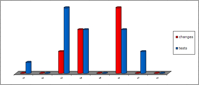
This helps us focus the testing where it matters, and we have found it to reflect our "gut feeling" of the state of testing after a finished sprint pretty well.
In addition to the test coverage information, we also display the amount of time we have spent in test sessions, reporting bugs and setting up test environments, compared to the time spent out of session. The ambition is to identify the time thiefs, and to bring the time spent in test sessions to a maximum. More on this in a later post!